Go to the brush tool in Affinity Photo. In the tool settings click the “more” button. This will open the brush settings. Click the middle tab labeled “Dynamics”. Adjust the slider of the property you want to vary based on your pen pressure. Then in the drop down select “pressure”. Close the dialogue window and start painting.
Category: Tutorial
What is the Difference Between Opacity and Flow?
When most people digital paint they tend to default to using opacity to layer and blend their colors. However many people don’t fully understand the other option. Flow. Both Flow and Opacity allow us to control the transparency of our brushes.
What is Opacity
Opacity is the opaqueness or transparency of the brush. When using opacity the amount of color being added to the canvas is the same you are only changing how see-through it is.
What is Flow
Flow is how much color is being added to the canvas. Flow gradually adds color from no color to full color.
Opacity VS Flower in application
If you draw a dot with 25% opacity and 100% flow. Then draw a dot with 100% opacity and 25% flow. These two dots would look identical. However if you were to shade an area back and forth with each of these settings the one with 25% flow and 100% opacity would have s more saturated color. This is because flow adds color continually. Opacity only adds every time you pick up and put down your brush.
How to Quickly Add and Use Your Photoshop Plugins in Affinity Photo
Find the Photoshop Plugin Directory
On Windows go to the shortcut of Photoshop. Right click it and choose “open file location”.
Find the folder labeled plugins
On Mac go to your applications folder. Then go to Photoshop and then plugins.
Copy the file path of the Photoshop plug in folder

Add the plugins folder to Affinity Photo
Open Affinity photo. Inside Affinity Photo go to “edit”. Then go to “preferences”.

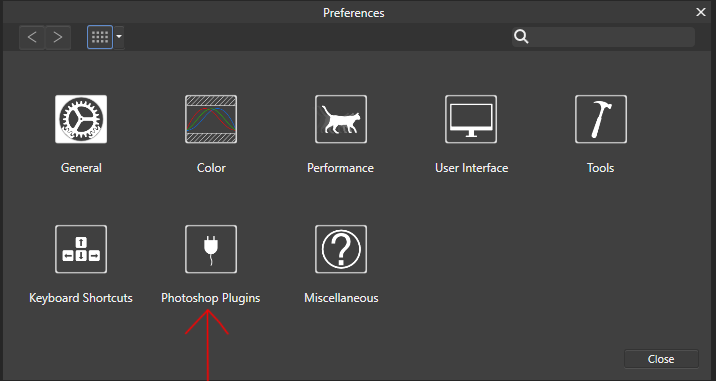
In the preference dialogue window go to “Photoshop Plugins”.
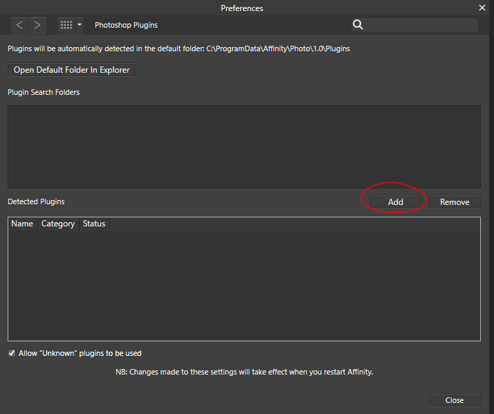
Click “add.”

Paste in the path of Photoshop Plugin directory and hit “select folder”.

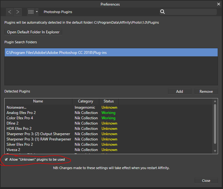
Click “close”. When prompted to restart Affinity Photo select “Yes”. Go back to edit > preferences > Photoshop Plugins. Check “Allow unknown plugins” and close

How To Make HTML5 Video Backgrounds
For this example I am utilizing a CC0 stock video. That I have trimmed down to a few seconds. When Working with HTML video it is best practice to include mp4, ogg and webM. These three files types encompass all the variation in the browser market, to make sure your video is as cross browser compatible as possible.
HTML Code for Video Background
First start by adding the necessary mark up for the video. The HTML5 video tag creates a block to house the video. In this example we give the video tag an attribute of “autoplay loop” to have the video continuously play. We also give it an id so we can target it specifically. Inside the video tag we have three source tags. Each source tag has a src and a type attribute corresponding to its file format.
<video autoplay loop id="videoBackground">

<source src="_videos/webBackground.mp4" type="video/mp4"> <!--MP4 Video-->

<source src="_videos/webBackground.webm" type="video/webm"> <!--WebM Video-->

<source src="_videos/webBackground.ogg" type="video/ogg"><!--OGG video-->

</video>
CSS Code for Video Background
The following properties ensure the video stays in place and does not move.
#videoBackground{

position: fixed;

right: 0;

top: 0;

left: 0;

right: 0;

}
The next properties ensure the video is always the size of the whole browser.
#videoBackground{

position: fixed;

right: 0;

top: 0;

left: 0;

right: 0;

min-width: 100%;

min-height: 100%;

width: auto;

height: auto;

}
The last property ensures the video is always behind the content.
#videoBackground{

position: fixed;

right: 0;

top: 0;

left: 0;

right: 0;

min-width: 100%;

min-height: 100%;

width: auto;

height: auto;

z-index: -1;

}
If you have any other z index properties on your page this must be the lowest of them.
How to Make Angled HTML Containers With CSS
Angled HTML containers are a great way to add interest and lead the eye on a website. It’s a simple tool to make a website stand out from the crowd. This fast and easy tutorial can be used on any HTML block element. It is done by creating a pseudo container after and behind the original. Then aligning, matching and transforming it to create the illusion of a continuous container.
First select the element you wish to angle. Style it as you wish and set position to relative.

header{

position: relative;

width: 100%;

height: 10em;

background-color: #FF3300;

}
Next target the element and use the pseudo selector “after”. Then add the following styles.
header::after{

position: absolute;

width: 100%;

height: 100%;

content: '';

background-color: inherit;

top: 0;

right: 0;

bottom: 0;

left: 0;

z-index: -1;

transform-origin: top left;

transform: skewY(6deg);

}
How the Code Works
This code creates a pseudo element after the header. The content of this pseudo element is empty which is determined by the content property having a value of empty single quotes. The width and height property has it completely fill its parent. The position property along with the top, right, left and bottom, sets its position and prohibits it from moving within inside of its parent. The background inherit makes sure the slant automatically matches its parent’s background color. The z-index places the pseudo element behind the original element. The transform origin and transform sets the placement and quantity of the angle.
Change the “transform-origin” and “transform” property to adjust the effect.
How to Create Page Transitions in Seconds Using CSS
This tutorial will show you how to create interesting CSS transitions on your HTML pages. Once learned these can be applied to any page in seconds to excite your users. To create these page transitions we will utilizing a well known open source CSS library called animate.css
Download Animate.css
To start go download animate.css.
While on the page it is important to notice each animation can be previewed by selecting it on the pull down list. Also notice how the animation is written. This is how the animation is written as a class.
Creating the Page Transition
Creating the page transition is very simple. Start by linking Animate.css into each of your HTML pages. Next you just need to add two classes to the HTML tags in each of your pages. First add the class “animated”. This class is required by the library for any element that will be animated. After this add the name of the animation you want to use for the transition and your done!
<!doctype html>
<html lang="en" class="animated fadeIn">
<head>
 <meta charset="utf-8">
 <meta http-equiv="x-ua-compatible" content="ie=edge">
 <meta name="viewport" content="width=device-width, initial-scale=1">
 <title>CSS Page Transitions with Animate CSS Page 1</title>
 <link rel="stylesheet" href="_css/style.css"> <!--For page structure-->
 <link rel="stylesheet" href="_css/animate.css">

</head>
<body>
 <header role="banner" >
 <h1 role="heading">CSS Page Transitions animate.css</h1>
 <nav role="navigation">
 <ul>
 <li role="presentation"><a href="index.html">Page 1</a></li>
 <li role="presentation"><a href="page2.html">Page 2</a></li>
 <li role="presentation"><a href="page3.html">Page 3</a></li>
 </ul>
 </nav>
 </header>
 <main role="main">
 <h2 role="heading">Page 1</h2>
 <p>Lorem ipsum dolor sit amet, consectetur adipiscing elit, sed do eiusmod tempor incididunt ut labore et dolore magna aliqua. Ut enim ad minim veniam, quis nostrud exercitation ullamco laboris nisi ut aliquip ex ea commodo consequat. Duis aute irure dolor in reprehenderit in voluptate velit esse cillum dolore eu fugiat nulla pariatur. Excepteur sint occaecat cupidatat non proident, sunt in culpa qui officia deserunt mollit anim id est laborum.</p>
 </main>
</body>
</html>How to: Rotate an image in 3D with CSS animation
HTML Page
Start by creating an image in your html page and giving it a class. For this demo we will use the class “imageSpin”
<!doctype html>
<html lang="en">
<head>
 <meta charset="utf-8">
 <meta http-equiv="x-ua-compatible" content="ie=edge">
 <meta name="viewport" content="width=device-width, initial-scale=1">
 <title>Rotate Image in 3D</title>
 <link rel="stylesheet" href="style.css">
</head>
<body>
<img src="areVisualLogoMark.png" alt="ARE Visual Logo Mark" class="imageSpin">
</body>
</html>
CSS Page
How the Animation will Work
The animation will utilize the CSS “rotateY” property. There will be two keyframes one where the image rotation is set to “0deg” and the other where it is set to “360deg”. The tweening between the “from” and “to” points will create the animation.
Creating the Animation
Start by creating the keyframe animation and naming it. For this demo I will be calling the demo spin.
@keyframes spin {
}
Now create the starting “from” value and the “to” value.
@keyframes spin {
 from{
 transform: rotateY(0deg);
 }
 to{
 transform: rotateY(360deg);
 }
}
Now we have to call the animation. To do this we select it by calling the class we gave our image. Next we need to set the “animation-name” that we defined earlier. After that we set the “animation-timing-function”, this is the CSS equivalent of easing. For this demo I am going to use “linear” value so the speed of the animation is consistent for the whole duration. Next we will define the “animation-iteration-count.” This is how many times the animation will repeat. For this demo we will set it to “infinite” so it will keep repeating. The last property we will set is “animation-duration” this is how long the animation will take to complete. For this we will use 5 seconds.
Adding browser specificity
CSS animations are still not completely universal. This step may not be needed but generally it is good practice. To make sure our animation renders correctly across browsers we want to add properties specific for each browser. To do this add the following code.
@keyframes spin {
 from{
 transform: rotateY(0deg);
 moz-transform: rotateY(0deg); //Firefox
 ms-transform: rotateY(0deg); //Microsoft Browsers
 }
 to{
 transform: rotateY(360deg);
 moz-transform: rotateY(360deg); //Firefox
 ms-transform: rotateY(360deg); //Microsoft Browsers
 }
}
@-webkit-keyframes spin{
 from{-webkit-transform: rotateY(0deg);}
 to{-webkit-transform: rotateY(360deg);}
}
.imageSpin{
 animation-name: spin;
 animation-timing-function: linear;
 animation-iteration-count: infinite;
 animation-duration: 5s;
 -webkit-animation-name: spin;
 -webkit-animation-timing-function: linear;
 -webkit-animation-iteration-count: infinite;
 -webkit-animation-duration: 5s;
}How to Improve Your SEO and Increase Your Pagerank
Have a blog
Blogs are a growing trend. They provide a way to connect with your audience on a personal level. They open the door for anecdotes and to get people talking. They allow discussion about things in the moment. Not all content makes sense to have a permanent place on a website, but they still relate to your audience. Blogs are great for this type of content. Blogs are also great for SEO. Here’s how to get the most out of your blog to increase pagerank.
Use your blog to promote your keywords
Blog about topics that relates to your website. By doing so you will use keywords in your posts that are in your website. This will make them appear more on your website and make your page rank higher for those keywords. Make sure to use keywords in titles and headings along with copy.
Freshness of content
Part of Google’s PageRank Algorithm is Freshness of content. This means content that is updated regularly will rank higher then content that is not.
Tips for setting up your blog
- Use WordPress. Google crawls and indexes WordPress more then any other blogging platform.
- Make sure your blog directory is in the root of your site with clear links to it from the main site and back from the blog.
- When choosing or developing a theme make sure it is mobile friendly.
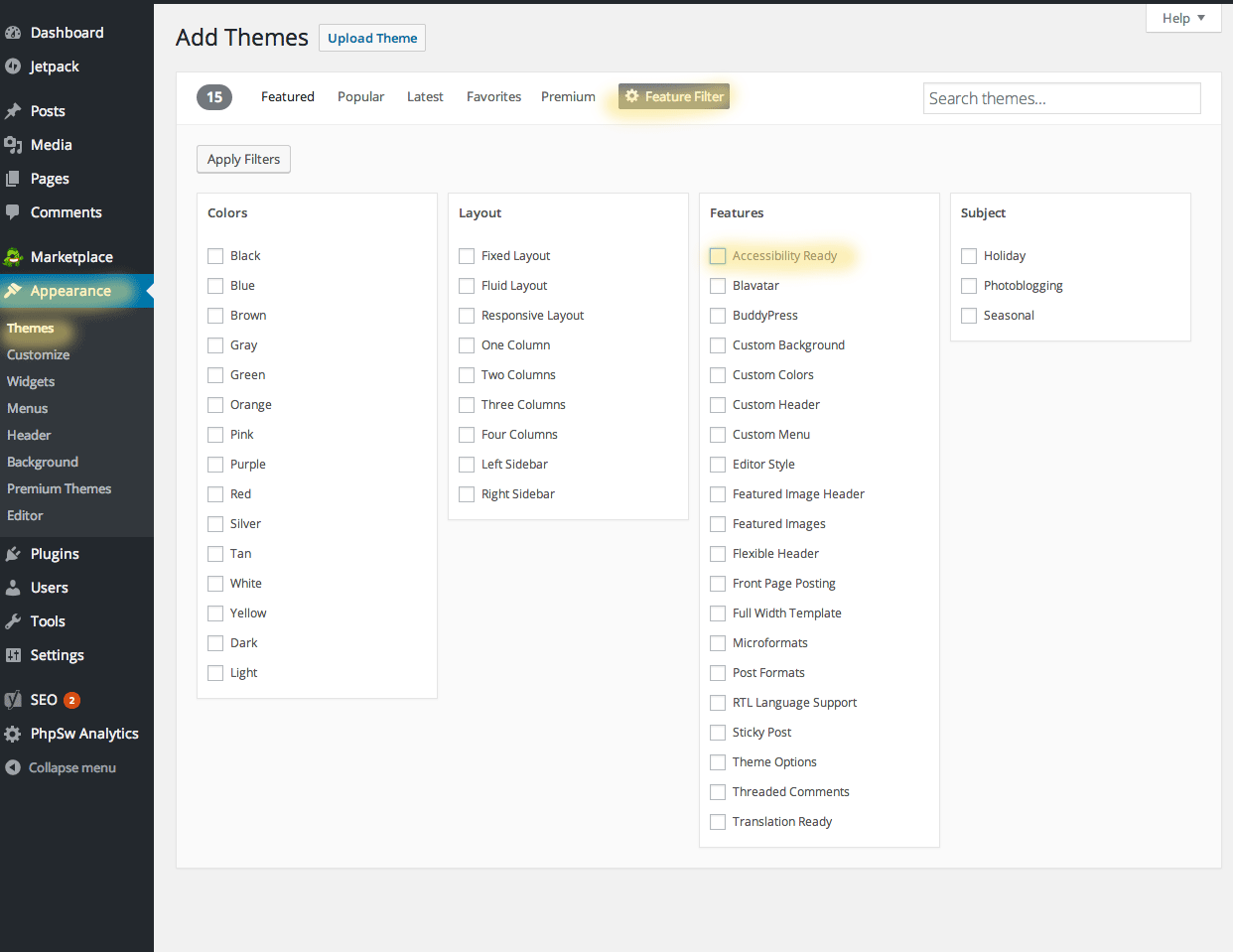
- When choosing or developing a theme make sure it is accessible with ARIA roles. If you are choosing a theme this can be done by going to Appearances>Themes>WordPress.org Themes>Feature Filter> Check accessibility Ready

- Install SEO plugins. Make sure included in them are atleast sitemap.xml and robots.txt.
- Change the permalinks settings to something readable. A good default is the name of the post. This can be done by going to settings>permalinks>post name

Content is king to Google
Regularly updated content
There are other ways to establish regularly updated content. If a blog does not fit your site think of other ways to add fresh content to your site. Forums, feeds and reviews are other possible tools to consider.
Use descriptive link names
When choosing text for a link it is important to Google that the text pertains to what the source is about. “Click here” and “Read more” are not good naming for links.
Descriptive image names
The name of your image matters. An image with proper naming is more likely to come up in a Google search. This increases traffic to your site. Also it allows another place for your keywords to appear.
Descriptive alt tags
For the same reasons you should use descriptive alt tags. Remember one purpose of alt tags is to describe an image to a blind person. When I am advising people on how they should write their alt tags I tell them. Describe this image to someone who has never seen. This technique helps gives context to finding words to describe the purpose and physical description of an image.
Be mobile friendly
Google heavily favors sites that are mobile friendly. Check to see if your site is mobile with Google’s official Mobile-Friendly Test
Optimize your speed
Google favors pages that loads quickly check to see your site’s speed with Google’s PageSpeed Insights.
Sitemap.xml and robots.txt
Sitemap.xml provides a logical structure of a website that helps Google crawl a site. Robots.txt tells Google it has access to a page/file or not. When creating robots.txt it is beneficial to point to the sitemap.xml to help Google find it. These can be hand coded or there are plenty of generators out there. Sitemap.xml generator robots.txt generator
Backlinking and Social Media
Google favors sites with people linking to them. Links from website with more traffic are more valuable. Use social media to help build links to your website. Make sure a link to your website is incorporated into all social media channels. Give incentives for people sharing your site. Use connections on social media for cross promotion.

