Wilderness Safety Quiz
Frontend Development

Frontend Development
Frontend Development

Backend Development
Backend Development, Frontend Development

Backend Development
Graphic Design
Graphic Design
Frontend Development, Website Administration
Idaho wants to teach wilderness safety to people visiting and they don’t want to be boring and/or authortain.
Gamification! We created a wilderness safety quiz so people can learn in a fun way. Depending on how well someone does they get a different cute animal. They then get an option to share on social media.
I was the front end developer on the project. It was my joy to create the page based of the designer’s mockup. In addition to making the page look good I created a program to score the quiz.
When a question is unanswered 3 choices are shown.
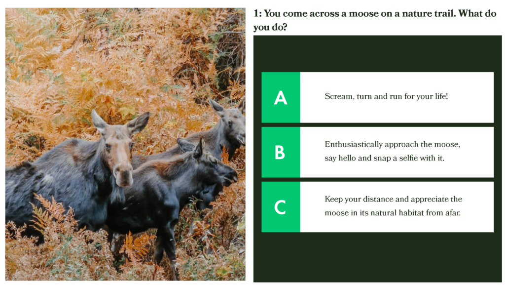
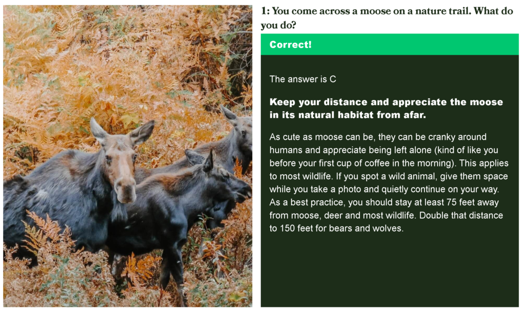
When the question is answered correctly it turns green and provides more information
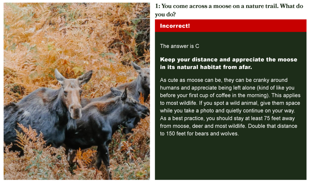
When a question is answered incorrectly it turns red, shows the correct answer and explains why.
At the top of the page each question is tracked to show how many have been answered correct, incorrect and unanswered. At the bottom of the page there is a button to submit the quiz. This button only shows if all the questions have been answered. This is to get clean analytic data in Google Tag Manager.

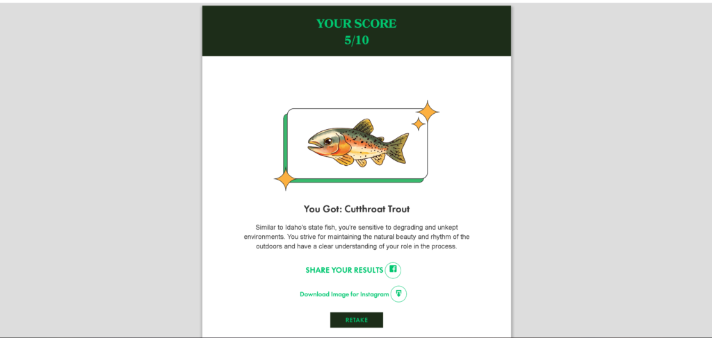
After the quiz is submitted. The user is brought a to a results page. This page show’s the score and provides a cute animal associated with the score. Lastly it provides an easy way to share the test on social media.
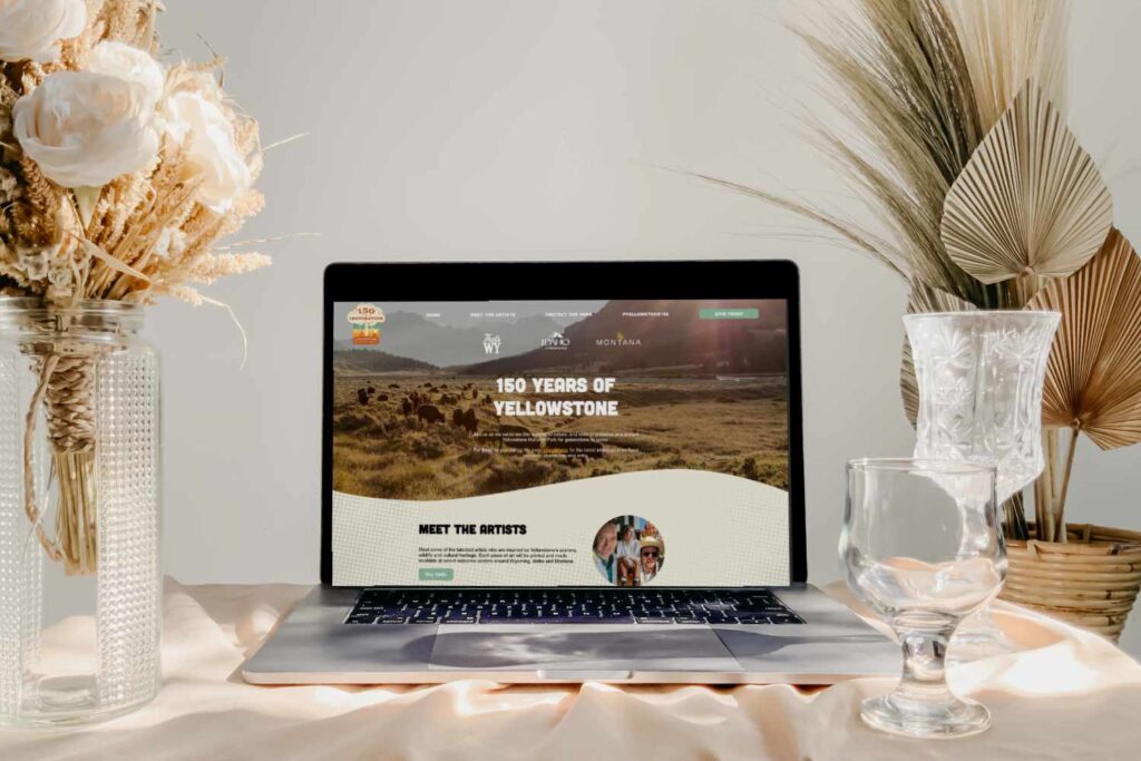
Yellowstone celebrated their 150th anniversary as a national park. To celebrate the states of Wyoming, Idaho and Montana put on an event! The event was focused around art inspired by Yellowstone. Madden Media was commissioned to create a microsite to advertise the event.
The primary goal of the site was promote the artists involved with the event and get people to attend.
Secondarily the site promoted green initiatives of park.
Tertiary the site furthered the account’s crowdsourcing. This was done by collecting people’s photos and stories with the park and linked to a donation page.
I worked as a front end developer on the site. It was my pleasure to take the design mock up and turn it into a living breathing website using PHP SASS and JavaScript.
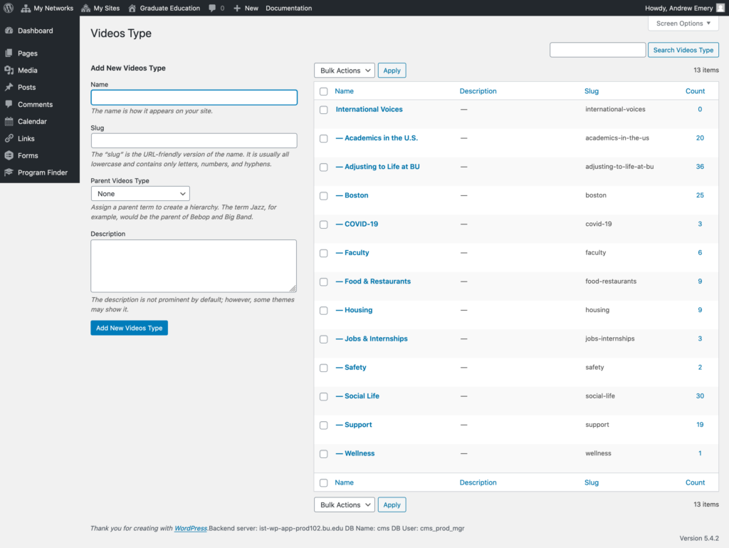
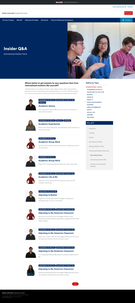
Boston University created a YouTube channel to share varied perspectives of graduate school. This was exceptionally valuable for connecting with an international audience.
The YouTube channel was far removed from the Graduate Education website. This made it hard to drive conversions. They needed a way to share students’ unique perspectives that could easily drive to the enrollment process.
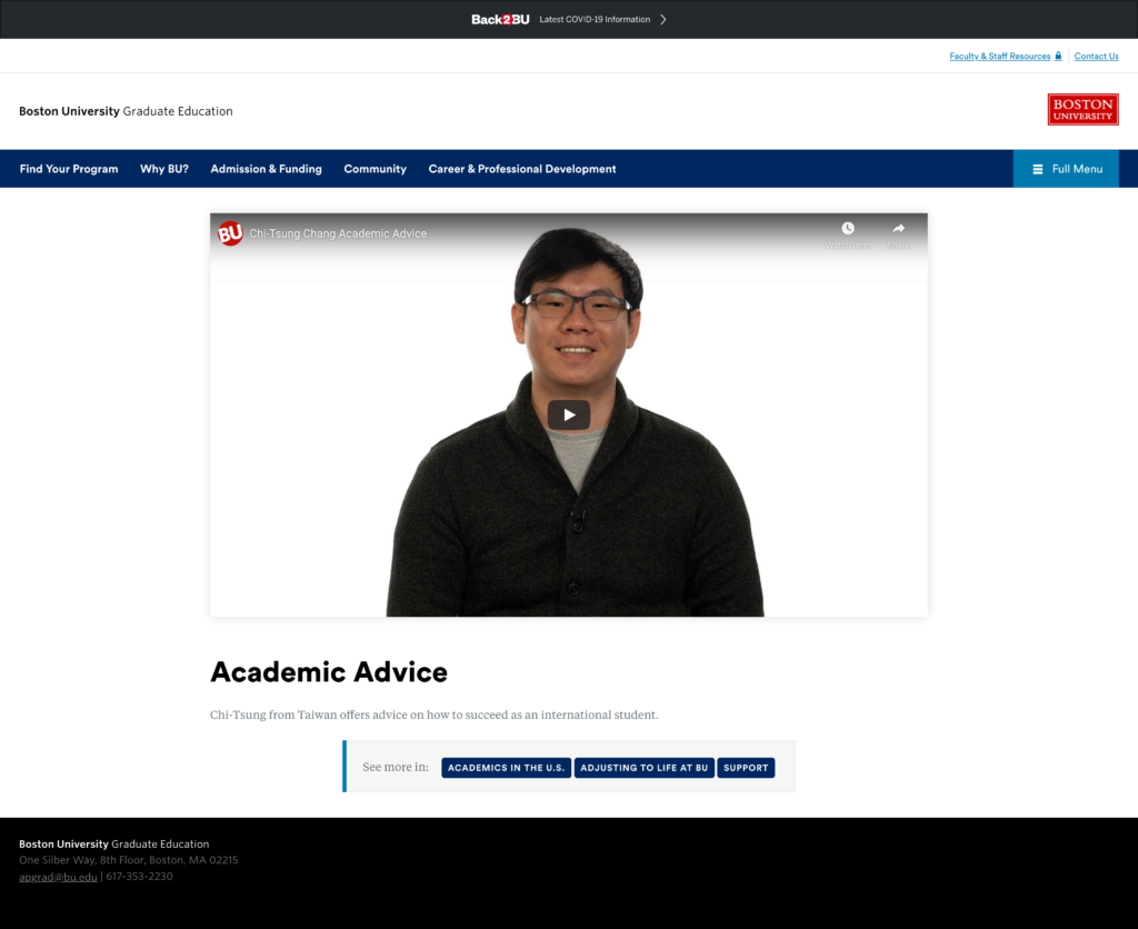
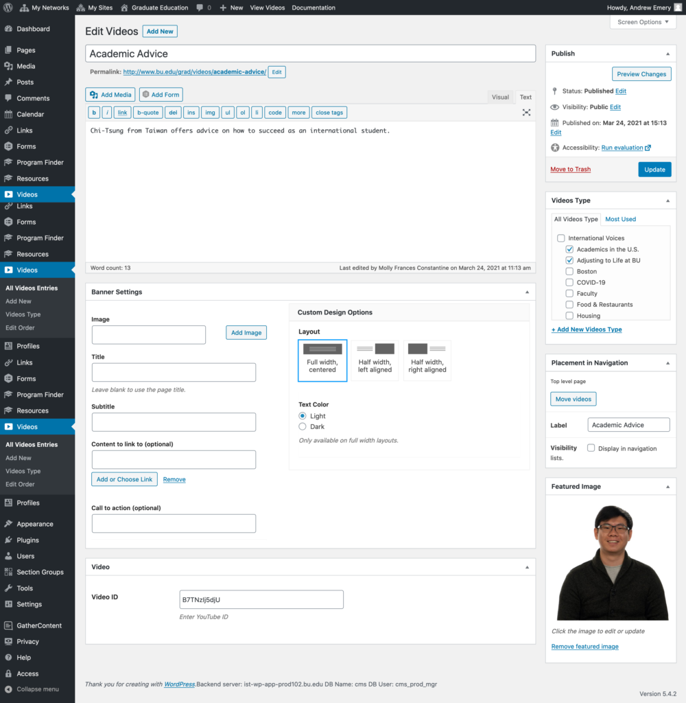
Interactive Design created video listing and video single templates. These templates allow the site admins to embed videos into their site.
We also created created a video slider to highlight videos on their existing landing pages.
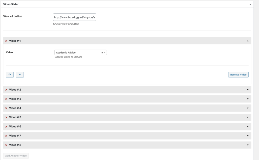
I was the back end developer on the project. I created the video listing and video single templates. I used cmb2 fields to allow site admins to embed videos without coding.
I was also a resource for making sure the front end output was perfect for the designer to style.
Lastly I made the back end of the video slider to allow site admins to create interactive JQuery sliders without coding.

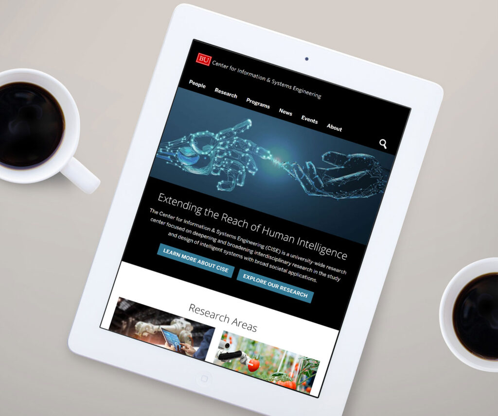
The CISE website was initially designed by an external vendor. The vendor was not able to execute their plan inside of BU’s development environment. In addition to this, a large portion of their already small budget was used during the design phase.
The goal was to utilize the designs by the external vendor and use out of the box products managed by Interactive Design as much as possible to meet the highly custom needs of CISE on their small budget.
I used many of the out of the box products created and managed by Interactive Design, building on top of them and modifying them as needed. I attempted to keep custom development to a minimum to be mindful of the budget.


The media publications of the faculty at Pardee are an important selling point to the school. They needed a solution to highlight posts in their site and associate them with their staff.
I created a category to isolate their “in the media posts” from their other posts. I then used these posts to create custom queries and attach them around the site using hooks.
The homepage is utilizing the BU Landing Page Plugin. Since this plugin is utilized university wide, we are not able to edit it on a site by site biases. I solved this problem by attaching the “in the media” section to a hook on the content area.
I created CMB2 boxes to allow the client to have control over the following:


The profiles page was created using the BU Profiles Plugin. This plugin creates a custom post type called profiles. The posts are associated with the profiles using a cmb2 box so if a user goes to a faculty’s profile they see only the posts associated with that faculty.


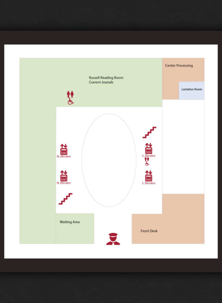
Our goal was to design engaging floor maps based off architectural drawings to help patrons best navigate, understand and enjoy the library.


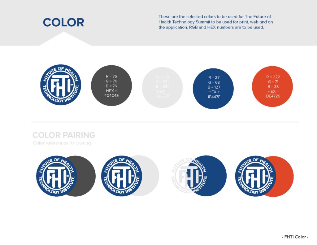
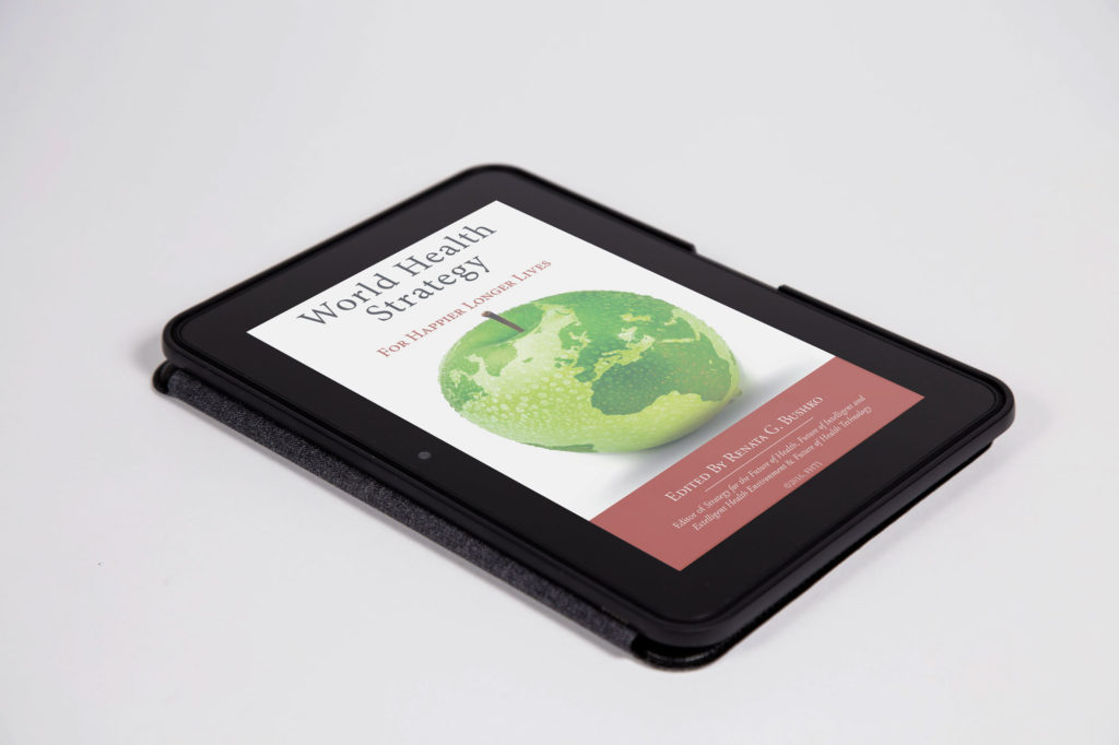
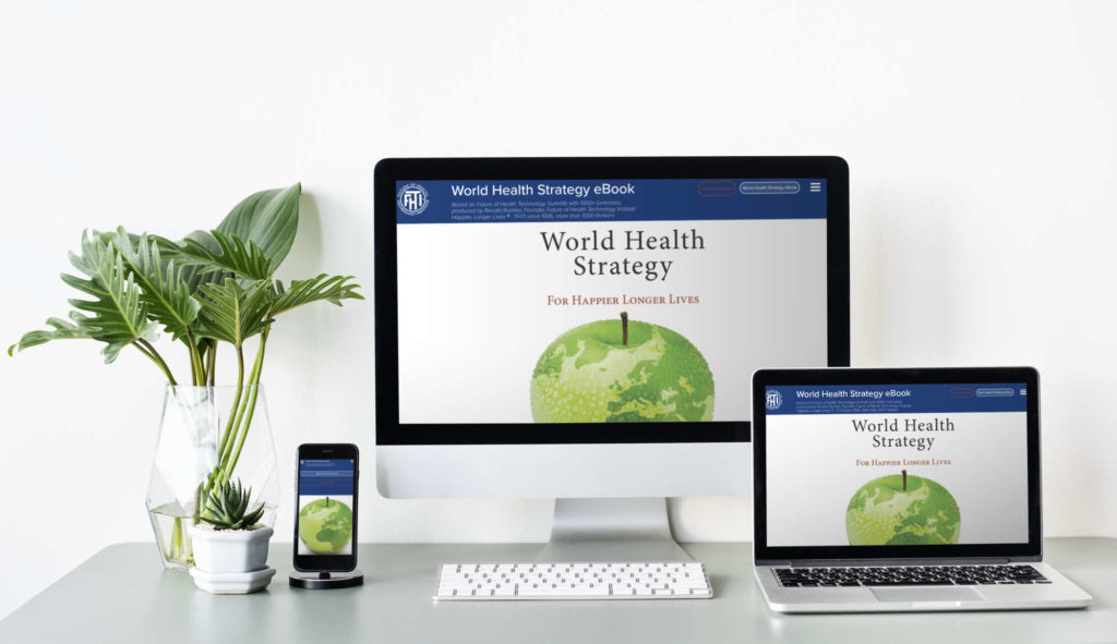
The goal of the World Health Strategy for Happier Longer Lives Book was to cohesively bring together dozens of different medical studies into a single living interactive eBook to share the revolutionary work done by the institute with their followers around the world.
“The Future of Health Technology Institute (FHTI) is a think-tank focusing on key technologies and key challenges to the future of global healthcare. Their goal is to bring together leading thinkers in the area of newly emerging technology and health and to redefine world health strategy so that technology investments can result in less disease and better, affordable treatments.”

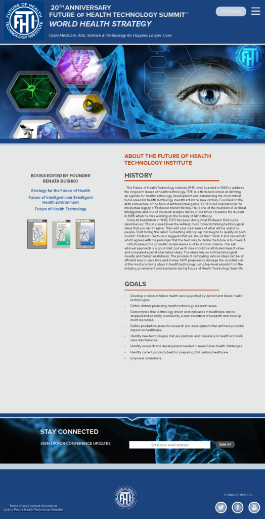
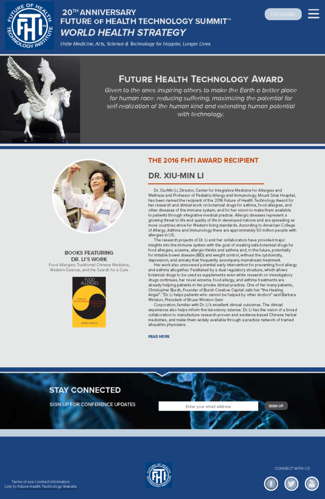
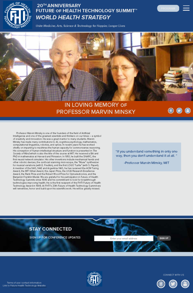
The goal was to create a mobile responsive website to work in conjunction with the institute’s main website to promote their yearly summit and inform potential patrons with information about the luminaries.
I was responsible for turning the beautifully designed mock up created by Jehan Said into a full functioning responsive website.
The site today is now used to promote the World Health Strategy for Happier Longer Lives eBook and the thousands of luminaries that contribute to FHTI.
“The Future of Health Technology Institute (FHTI) is a think-tank focusing on key technologies and key challenges to the future of global healthcare. Their goal is to bring together leading thinkers in the area of newly emerging technology and health and to redefine world health strategy so that technology investments can result in less disease and better, affordable treatments.”

